Redesigning BimmerShops
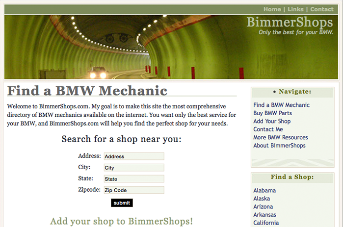
In December 2005, Andy Powell launched BimmerShops, a directory of independent BMW repair shops. The network of directories has since branched out into other (mostly European) manufacturers, like Mercedes-Benz, Audi, Porsche, Volkswagen, and around ten others. In June 2012, I was hired to take over the day-to-day web development of BimmerShops along with its sibling sites. Soon after, we launched a new responsive design. (version 3)
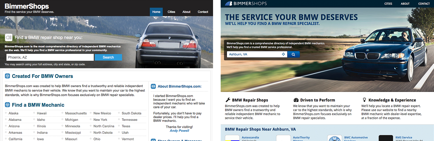
Like most sites, our mobile traffic over the years has overtaken desktop as the primary way that visitors choose to interact with the directories. Our foresight had paid off, however there were many parts of the UI that needed addressing. We had too many textures, gradients, rounded corners and minor inconsistencies that made pages feel busy and content hierarchy confusing.
To coincide with the redesign, I also wanted to move to a single-page app that communicated with the server though small JSON payloads, to improve the site’s overall performance and responsiveness.
Design
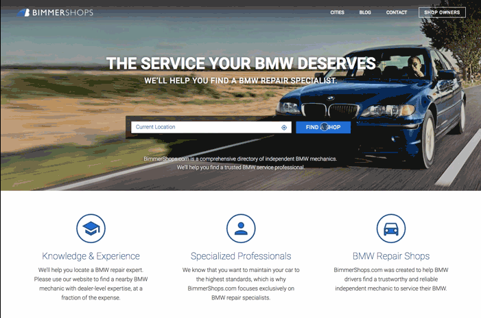
Unlike most web apps, many of the visitors who come to BimmerShops are already frustrated. Maybe they got up Monday morning to find that their car wouldn’t start or they pulled us up on their phone while broken down on the side of the road. Whatever the case, we want to do everything we can to get out of their way and help them find a repair shop as quickly as possible. That means no annoying newsletter sign-up modal windows, no native app splash screens or any other nonsense.
On the design side, I implemented Bootstrap as our base front-end framework and many Material Design guidelines. It’s our hope that our visitors will immediately feel familiar and comfortable with the experience, given the popularity of these design components.
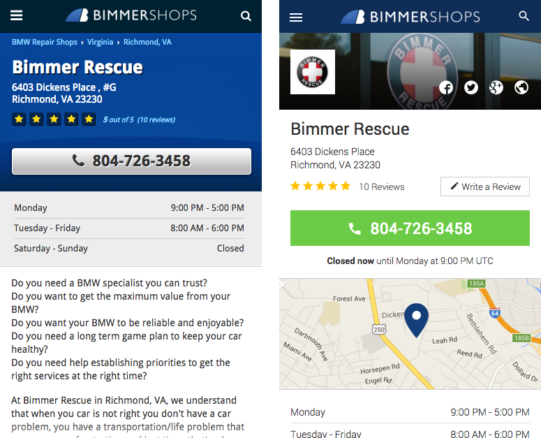
The search results pages are the most common entry point into our directories. We added imagery of geographical regions (mountains, snow, beach, etc.) and major city skylines to help make the search results look more like a curated list and less like a dynamically generated database dump. This recycles some old Perry Marshall page optimization advice that suggested using geo-localized imagery on landing pages to help the page feel familiar and increase engagement.
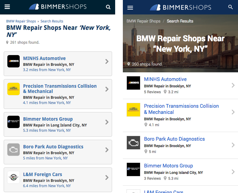
As part of our effort to avoid visitor annoyance, we present information as upfront as possible. The main call to action on a shop’s listing page is the shop’s phone number, not a “write a review” button. We’re also not hiding the phone number just to encourage clicks or showing any distracting advertising above the fold. If the shop has their hours filled in, then we let you know at a glance if the shop is currently open or when they will be open again. Custom header images, cleaner photo galleries and a list of amenities have also been added to many of the new listing pages.
Sigh… JavaScript
Our 3 year-old site had an array of spaghetti jQuery functions compiled together using some Gulp tasks and Browserify. Even though BimmerShops is relatively simple, we needed a more structured foreward-thinking approach. I had been playing around with Angular and Backbone, but was running into a lot of trouble when it came to server-side rendering.
A majority of the visitors to BimmerShops come from search engines. A great deal of time is spent to ensure that our shop listings have the best unique content available. From an SEO aspect alone, server-side rendering is a must. Coupled with our mission to be as frustration-proof as possible, we also needed server-side rendering to improve the time to first page load. Even if Google can crawl Javascript rendered pages now, the added fault tolerance that progressive enhancement provides allowed us to continue to support older browsers (IE8 & below) without a great deal of additional effort.
When I ran across Spike Brehm’s talk, The Evolution of Airbnb’s Frontend, I was convinced that React was a good way to go. Even though our server-side app is PHP-based, using Airbnb’s approach meant all I needed was a Node installation somewhere on the same network to send HTTP requests to and get fully rendered HTML as a response. Testing the render time against plain PHP views or compiling Handlebars views, the difference was non-consequential. Better yet, since the Node app is completely stateless, if we ever needed to, we could scale up to more view rendering servers with relative ease. If the Node server times-out or goes down for whatever reason, an empty div will be returned by the PHP server and React will populate it like normal.
Key selling points for React were that we could use NPM for package management, ES6 and JSX syntax, and most of all, React Router made Webpack code splitting really painless. Code splitting is particularly important in our use case because we have two main groups of visitors, those looking for a repair shop and the repair shops themselves. There are many support pages that are geared toward repair shop owners, so it doesn’t make sense to burden normal visitors with those assets.
Using Facebook’s Flux architecture made it possible to easily implement features such as skeleton screens, modals, geolocation, and page preloading. Events on a component could now change the state of a completely unrelated component somewhere else on the tree. For example, based on years of data we know that 50% of visitors, who view a search results page, will visit one of the first three shops. With this in mind, after the search results page loads, we go ahead and preload the first three shops into our page store.